
Apple has always set a precedent for innovation in the tech world, and the debut of Liquid Glass at WWDC 2025 is no exception. As a design philosophy that seems poised to redefine how we interact with our devices, the Liquid Glass concept brings a visually radiant and fluid aesthetic across all Apple devices. This new design language aims to evoke feelings of transparency and fluidity while a layer of translucent, glass-like interfaces floats above previously static elements. However, while the shiny allure of this design captures the imagination, users are left with a plethora of questions about its practicality and overall functionality.
Aesthetic Appeal vs. Usability
One of the striking features of Liquid Glass is its emphasis on translucence. App icons and text now appear much more vibrant and dynamic, yet this beauty comes at a cost. The initial implementation of the design can be disorienting, as the transparency makes elements feel cluttered and overwhelming. Users accustomed to the flat, straightforward design of previous iOS versions may find themselves grappling with this visual complexity.
Take, for instance, the Control Center. Rather than providing a quick, uncluttered access point for essential features, its current look is a cacophony of layers that seem to fight for attention. The lack of obvious demarcation among elements can lead users to feel lost amidst the shiny chaos. Apple may wish to reconsider making deeper changes to the opacity of various components, ensuring that the aesthetic doesn’t compromise user efficiency.
The Evolution of Familiar Interfaces
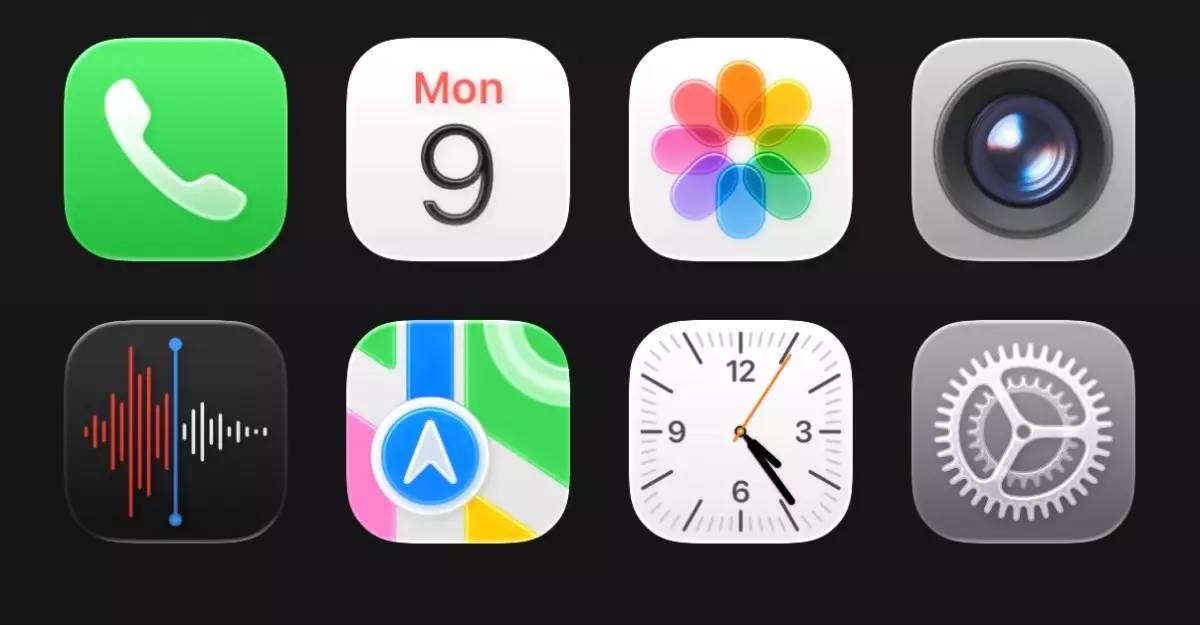
Another aspect of Liquid Glass involves a reimagining of familiar user interface elements. Icons are now more “bubbly,” which injects a measure of friendliness into the design. However, the novelty of these alterations quickly reveals itself to be a double-edged sword. While users may initially find joy in the playful aesthetics, it fails to deliver the same ease of recognition and tactile familiarity that previous versions provided.
A case in point is the Clock app. The rounded tab bar, though visually appealing, complicates the user experience. The playful animation of the tab selector mimics the movement of water droplets—a clever idea, yet one that can feel gimmicky rather than genuinely useful. Upon tapping between tabs, users might find themselves relying more on memorization than on intuitive navigation.
Text and Settings: A Space Odyssey
Apart from aesthetic shifts, Liquid Glass imposes its influence on aspects like typography and spacing within settings. Here, the implementation seems to falter, as excessive spacing between settings categories presents a user’s nightmare of scrolling and locating necessary functions. This lack of cohesive density can hinder the user experience, especially when every tap or swipe feels like an unnecessary journey through vast expanses of digital space.
Moreover, the keyboard undergoes a visual redesign, straying from what many users might consider functional familiarity. The question arises: is design fluidity compromising user efficiency? Apple, known for its focus on user-centric design, now appears caught in the tug-of-war between the innovative and the intuitive.
Adapting to Change: A User’s Perspective
Initially daunting, the sweeping changes of Liquid Glass have begun to grow on some users after spending adequate time engaging with them. Adapting to new designs often requires patience, especially in a landscape where user preferences are steeped in nostalgia for what once was. Apple’s previous willingness to embrace significant shifts—like the original adjustments seen in iOS 7—gives a glimmer of hope that Liquid Glass can achieve a similar level of acceptance.
Nevertheless, it’s vital for Apple to remain attentive to user feedback and work through the small but impactful complaints that can shape overall satisfaction. The urgent need for tweaks and refinements screams for a responsive design philosophy, embodying both innovation and reliability. As the tech giant prepares for the official launch of iOS 26 this fall, the anticipation lies not just in beautiful aesthetics, but in ensuring that functionality remains robust for a diverse user base that thrives on efficiency and intuitiveness.
embracing the bold risks of Liquid Glass offers an opportunity for Apple to demonstrate its commitment to continuous improvement and attentive design. Ultimately, the journey is about striking that balance, making the enchanting and the practical coexist within the smooth contours of modern technology.