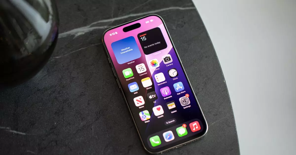
In a world awash with technology, the smartphone has become a ubiquitous part of our daily lives. Over the years, the design of our smartphone interfaces has evolved, yet one influential element has remained significantly unchanged: the app grid. The grid system—with its rows and columns of brightly colored icons—has been the cornerstone of mobile operating systems for over a decade. It feels comfortable and familiar but can also become overwhelming, particularly as we download more apps that vie for our attention and space on the homescreen.
As the number of apps proliferates, the cluttered display can morph from being merely an organizational tool into a source of anxiety. In this context, the latest developments in iOS, particularly with the introduction of iOS 14 and the recent iOS 18, shine a light on alternative approaches to managing our digital lives. With these upgrades, users can now organize applications more freely, incorporating widgets and utilizing the app library to break free from the traditional grid paradigm.
My personal experience with the grid system reflects a common struggle among smartphone users. I found myself increasingly suffocated by the numerous icons demanding my attention. The decision to reconfigure my homescreen led to a transformative experience. By dedicating time to reassess the apps I frequently use, I discovered that many icons—once on my primary display—were rarely accessed. Thus, the act of curating my homescreen became not just about aesthetics, but also about utility and ease of access.
With iOS 18, the ability to arrange apps and widgets according to personal preferences allowed me to methodically strip away the excess. By repositioning key controls and using Siri’s suggested apps for quick access, I was able to simplify the overall experience of using my device. An uncluttered homescreen not only lessened visual distractions but also enhanced my focus and productivity on crucial tasks. I’m not alone in these sentiments; many modern users are learning to embrace this minimalistic approach, focusing less on the overwhelming visual clutter.
In conversations with my colleagues, I uncovered intriguing parallels in our approaches to digital organization. One colleague, Wes, has harnessed shortcuts and widget functionalities to streamline his digital workspace further. Rather than relying on traditional app icons, he prefers to launch actions through efficiently designed shortcuts that allow him to access his tasks swiftly. This proactive organization means he has successfully reduced the visual distraction that commonly accompanies a busy apps grid.
Another colleague, Jay, opted for a more straightforward, yet equally effective, approach. He limits the number of apps on his homescreen to just seven, reinforcing a strategy centered on intentional use. Such a minimal collection lets him keep frequent tasks front and center without succumbing to the lure of rarely used apps. This focused, task-oriented method has the dual benefits of simplifying user experience and reducing decision fatigue.
The shift from maintaining a standard grid to organizing around essential functions signifies a broader trend toward digital minimalism. As users grapple with the ally of enhanced capabilities, there emerges a newfound desire to break free from the conventional mold. Utilizing features like the app library allows users to distance themselves from the constant visual stimuli of the grid, enabling a clearer thought process and mental space.
However, this transition does not come without its challenges. One potential drawback arose in the form of missed notifications, once prominently displayed by those little red dots signaling alerts. While living off the grid has alleviated the anxiety of visual alerts, it has introduced a level of risk regarding disengagement from active notifications. Nonetheless, by trusting in the efficiency of Siri’s suggestions or employing search functions, I discovered that managing this potential pitfall is feasible.
Recent advancements in artificial intelligence and machine learning support promising prospects for enhancing user experience on mobile devices. By gaining a deeper understanding of user behavior and preferences, future iterations of operating systems could deliver an even more tailored interaction. The refinement of search and suggestion algorithms could significantly streamline how users access their desired apps, making unnecessary clutter a relic of the past.
The journey toward an organized digital life intertwines psychological well-being and daily efficiency. As we explore alternatives to app grid layouts, the message is clear: simplicity fosters mental clarity and purpose. Embracing this mindset does not rely solely on technology; it also requires a commitment to reshaping our digital habits. As the tech landscape evolves, the future promises individualized experiences that anticipate our needs, ensuring smartphones remain helpful companions instead of overwhelming distractions.

